My beloved Pebble watch started to die shortly before the company was destroyed by one of its greedy investors. I had planned to replace it with a new Pebble, seeing as this watch/piece of wearable tech was one of my all-time favorite devices. I couldn't believe the company ended just like that. It was the business story of horrors. Here I was, with an amazing device I loved, that became increasingly unusable every day. The screen started to pixelate and garble. Apparently this was the one flaws of pebbles, something that eventually happened to all of them. I felt pretty lucky, since mine lasted years longer than my boyfriend's. Still. Time to get a new device.
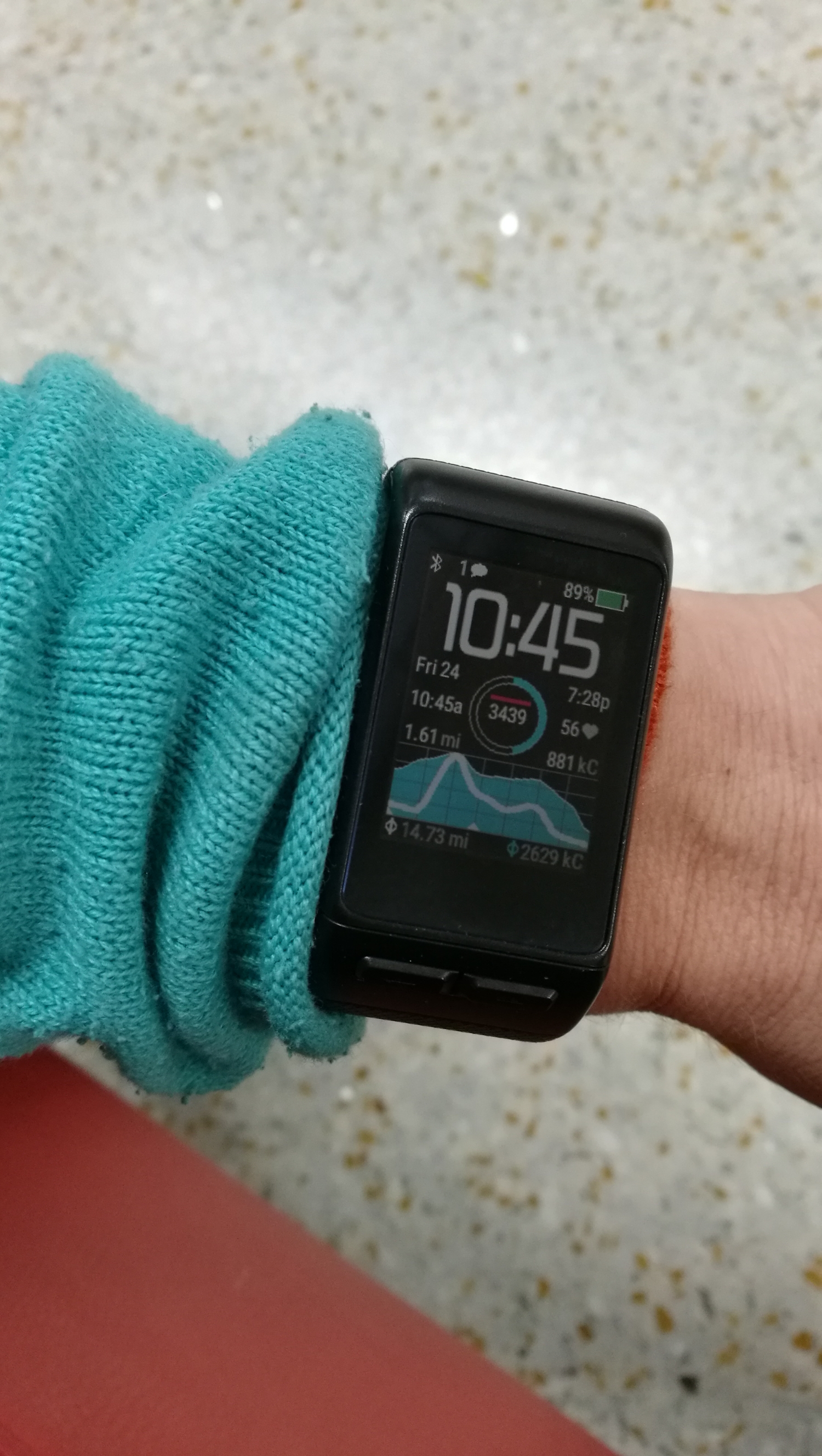
I spent hours upon hours reading reviews online, comparing features, and looking as devices in stores. I settled on a Garmin Vivoactive HR, in hopes to offset the expense of the device by having it serve as a watch and bike computer in one. From everything I read, the device's one flaw was inaccuracies with it's sleep tracking, which wasn't a concern for me. Sleep tracking was the one thing I didn't care to venture into.
I started writing a review for this watch when it was still new. I'm glad I waited over a year to finally publish it, as my feelings for it have warmed with time. It seems to work a little bit better with every update. I've had a lot of issues with this watch. I'll start by pointing out that I generated 17 threads thus far on the Garmin forum, trying to understand inconsistencies with this watch that haven't been addressed on the web. For instance, buttons on different windows respond differently. The two physical buttons on the bottom of the screen do the exact same thing with every window except one, the "review workout window." On all other windows the left button is a back/exit and the right a forward/toggle. For some reason the review workout screen, they do nothing. The touchscreen is also variable. For example, on the "review workout" touchscreen, the "no" option cannot be selected. Other users agree with my observations, but in over a year no one can explain why they are like this.
It has several other weird inconsistencies. If I use the "live track" option when recording a workout, the device won't sync to the app on my phone afterwards. If I am lucky, I can sync just by turning off live track and restarting both the device and my phone. If I am not lucky, I have to unpair the watch, restore it to factory settings, turn it off, clear app cache and data on the phone, uninstall the app, restart the phone, and then reinstall and pair the two devices all over again. Pairing the watch to my phone used to be a complicated dance that often took hours on hours of attempts until it would finally, randomly, connect. Luckily, I haven't had this issue for several months now. I imagine these annoyances might just as much be due to my phone as the device.
Still, the Garmin software itself seems bizarre. The Garmin Connect app for the desktop needs to be updated almost daily. Frequent updates are par for the course these days with phone apps, but not so much with desktop apps. It's annoying to have an update for Garmin every time I try to use my computer at home. The mobile app is the most fun to use out of the whole Garmin experience, although it's strange to me why Garmin Connect online is inconsistent with the mobile app. Take a look at the 2 calendars below. They are both for the time period, but I can see all sorts of daily data on mobile. Is there any reason Garmin opted to not have all this juicy, colorful data viewable from a desktop browser? I'll never know.


Commodo cursus magna, vel scelerisque nisl consectetur et. Donec id elit non mi porta gravida at eget metus.